










Neighborhood safety ratings matter because they compress multiple data streams — FBI UCR/NIBRS incident reports, Bureau of Justice Statistics victimization surveys, local police dashboards, and third-party aggregators — into a single signal that affects your property value, insurance premium, school quality, and daily comfort. They are not a verdict. They are a starting point, and knowing how to read them correctly is what separates a confident decision from an expensive mistake.
Here is what to do right now:
- Pull your target neighborhood’s local police department dashboard and look for incident maps, not just overall crime grades.
- Cross-reference what you find with the FBI Crime Data Explorer and the Bureau of Justice Statistics’ National Crime Victimization Survey (NCVS) to see whether the two sources agree.
- Schedule an on-site walkthrough at two different times: a weekday evening and a weekend morning.
- Get an insurance quote before you make an offer — premiums often reflect risk layers that a simple safety score never shows.
This guide draws on federal sources (FBI/BJS), peer-reviewed criminology research, and on-the-ground KC walkthrough experience to show you exactly how to interpret what those ratings are actually telling you.
Table of Contents
- Why do neighborhood safety ratings matter?
- How safety ratings shape property values, schools, and insurance
- What safety ratings get wrong — and how to spot it
- How to use safety ratings when choosing a home
- How to do a neighborhood walkthrough in 60–90 minutes
- Key Takeaways
- A local perspective on reading KC neighborhood data
- The Best in KC has a local resource for KC residents
- Useful sources and public data portals
Why do neighborhood safety ratings matter?
Safety ratings are composite scores, not raw data. Most pull from at least three inputs: reported incident logs (calls-for-service and police-recorded crimes), federal datasets like UCR/NIBRS, and environmental risk layers such as street lighting density or flood-zone proximity. Some third-party aggregators add resident survey responses or 311 complaint data. The result is a single number or letter grade that blends all of those streams through a proprietary formula you usually cannot inspect.
That distinction — between a raw incident list and an algorithmic score — matters enormously for how you use the number. A census-tract-level score hides what is happening on a single block. A citywide score hides what is happening in a single tract. Third-party aggregators blend police data with environmental and risk layers using weights that vary by platform, so two sites can score the same street differently without either being wrong.
“Divergence between UCR/NIBRS and NCVS is useful information, not a flaw. When the two systems disagree, that gap tells you something about reporting culture, policing patterns, or the ‘dark figure’ of unreported crime in that area.” — Council on Criminal Justice
Pro Tip: Before trusting any safety score, find the “methodology” or “about our data” page. If the platform does not publish its weighting formula, treat the score as a rough orientation, not a reliable benchmark.
How safety ratings shape property values, schools, and insurance
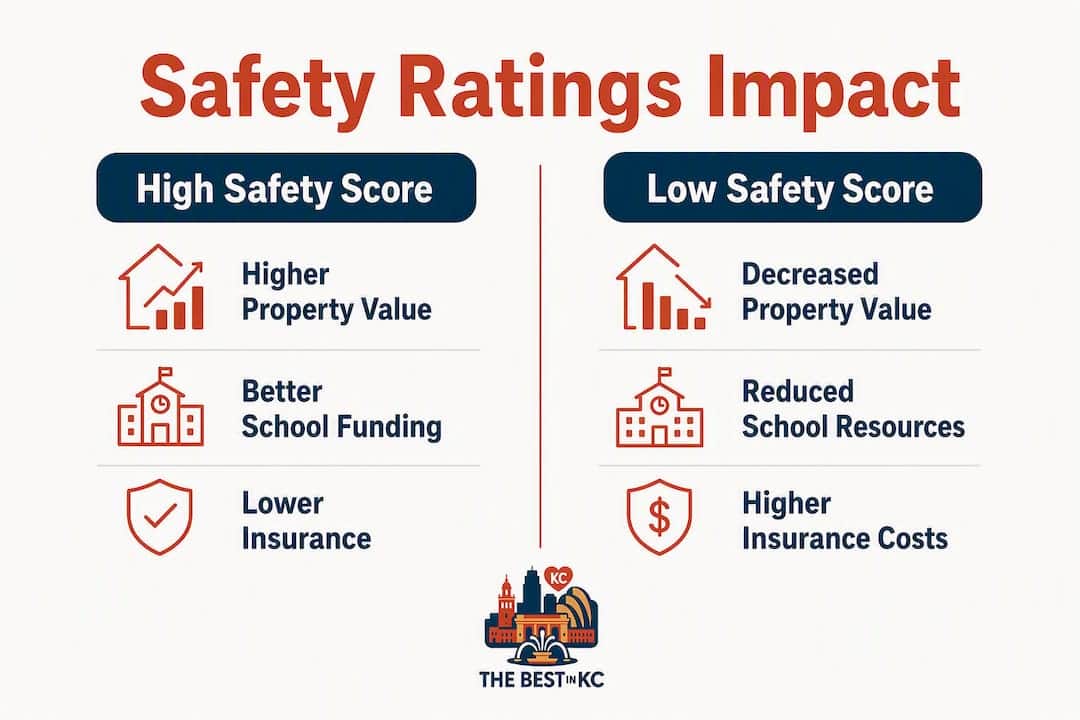
The financial stakes are concrete. Research on hedonic pricing shows that a 10% rise in violent crime is linked to a 2–5% drop in nearby residential property values. On a typical home, this decline can translate to significant lost equity — before you factor in resale risk or the cost of carrying a property in a declining market.

The school-funding link runs through the same mechanism. Lower property values shrink the local tax base, which reduces per-pupil funding, which affects long-term education outcomes for families with children. Crime rates shape the fiscal health of a community through feedback loops that compound over years, not months.
Insurance and lender behavior add another layer. Insurers and real estate investors draw from the same federal crime datasets but weight environmental exposures — flood zones, lighting gaps, proximity to industrial sites — equally with crime stats in their proprietary underwriting models. A favorable safety score does not guarantee a lower premium if environmental risk persists.
Cost lines that safety ratings touch directly:
- Mortgage value: Lenders factor neighborhood risk into appraisal and loan-to-value calculations.
- Homeowner’s insurance: Premiums reflect both crime data and environmental risk layers.
- Rent trajectory: Landlords in higher-rated areas typically command and sustain higher rents.
- Resale risk: A neighborhood trending toward lower ratings can compress future sale prices faster than broader market shifts.
Consider two buyers looking at similarly priced homes two miles apart in KC. One neighborhood carries a B+ safety score; the other a C. The C-rated block may be perfectly livable, but the buyer there will pay more for insurance, face a tighter pool of future buyers, and potentially see slower appreciation. The rating is not the whole story, but it is a real financial input.
What safety ratings get wrong — and how to spot it
Reporting culture is the most underappreciated distortion in safety data. Civically active neighborhoods with engaged residents tend to generate more calls-for-service and 311 reports, which inflates their recorded incident counts. A block where neighbors report every broken streetlight and suspicious car will look statistically busier than a block where residents distrust the system and report nothing — even if actual risk is lower on the first block.
Academic research confirms that reporting rates vary systematically by socioeconomic and demographic factors. Areas with higher concentrations of immigrants or economically distressed residents often show lower police-recorded crime not because they are safer, but because incidents go unreported. That “dark figure” of unreported crime is invisible in any score built on police data alone.
Spatial and temporal aggregation create their own blind spots. An annual citywide score tells you nothing about whether a specific block is risky at 11 PM on a Friday. Practitioner guidance consistently recommends checking time-of-day incident heat maps rather than relying on aggregate annual scores.
Four heuristics for detecting a problematic rating:
- No methodology disclosure — if the platform won’t say how it weights inputs, the score is opaque by design.
- Stale data — ratings built on incident data more than 18 months old miss recent trend shifts.
- No geographic granularity — a zip-code score for a zip code that spans four distinct neighborhoods is nearly useless.
- No victimization survey cross-check — police data alone, without NCVS comparison, misses unreported crime systematically.
Pro Tip: Compare the police-recorded incident count for your target block with the NCVS regional victimization rate for the same crime type. A large gap between the two is a signal worth investigating before you commit.
How to use safety ratings when choosing a home
Work through these steps in order, and complete steps 1–4 before making an offer.
- Verify source and date. Confirm which dataset the rating uses and when it was last updated. Ratings older than 18 months may predate significant neighborhood changes.
- Triangulate. Cross-reference the score with local police dashboards, FBI Crime Data Explorer, and NCVS regional data. Agreement across sources builds confidence; divergence demands explanation.
- Read trends, not snapshots. A neighborhood with a B rating trending upward over three years is a stronger buy than one with an A rating trending down.
- Add environmental layers. Check flood-zone maps, street lighting coverage, and proximity to vacant commercial properties — factors insurers weight heavily.
- Get insurance and mortgage quotes. Do this before the offer, not after. Premiums and appraisal adjustments will reflect risk layers the safety score may not show.
- Do the walkthrough. No data source replaces time on the ground.
| Evaluation criterion | What to look for | Practical implication for buyers |
|---|---|---|
| Methodology transparency | Published weighting formula | Opaque scores deserve less weight in your decision |
| Geographic granularity | Block or tract level vs. zip code | Finer grain = more actionable for a specific address |
| Update frequency | Quarterly or better | Stale data misses recent crime trend shifts |
| Source diversity | Police + NCVS + resident surveys | Single-source scores carry higher bias risk |
| Environmental factors included | Lighting, flood zones, vacancy rates | Absence means the score understates insurer risk |
How to do a neighborhood walkthrough in 60–90 minutes
A walkthrough is not a casual stroll. It is a structured observation with a specific agenda, and it validates or challenges everything the data told you.
- Daytime pass (30 minutes). Drive or walk the target block and two adjacent blocks. Note business occupancy rates, sidewalk condition, and whether public spaces show signs of regular upkeep.
- Evening pass (30 minutes). Return after dark. Check street lighting gaps, foot traffic patterns, and whether businesses are open and active or shuttered early.
- Targeted drive (15 minutes). Cover the four-block radius around the property. Look for broken windows, graffiti patterns, and the presence or absence of informal surveillance — neighbors on porches, dog walkers, people who make eye contact.
- Talk to two or three people. Ask open-ended questions: “How long have you lived here?” and “What do you like most about the block?” Let residents steer the conversation. You will learn more from what they avoid saying than from what they volunteer.
Combine what you observe with the police heat map for that block. If the map shows a cluster of incidents near a specific corner and you noticed poor lighting there during your evening pass, that overlap is meaningful. If the map shows incidents but the block felt active and well-maintained, dig into what type of incidents they were — property crime in a parking lot reads differently than assault on a residential street.
Pro Tip: In Kansas City, the best walkthrough windows are Tuesday or Wednesday evenings (6–8 PM) and Saturday mornings (9–11 AM). After your visit, check KCMO’s open data portal and the KC Neighborhood Safety Tips Checklist for block-level context that police dashboards sometimes miss. Neighborhood networking platforms can also surface resident-reported issues that never make it into official incident logs — worth checking before you finalize your read.
Key Takeaways
Safety ratings are a useful starting point, but only when you triangulate them across multiple sources, read trends over time, and validate them with an on-site walkthrough before making any financial commitment.
| Point | Details |
|---|---|
| Ratings compress multiple data streams | Scores blend UCR/NIBRS, NCVS, police dashboards, and environmental layers — no single score captures all of them equally. |
| Crime affects home values measurably | A 10% rise in violent crime is linked to a 2–5% drop in nearby property values, with downstream effects on school funding. |
| Reporting culture distorts scores | Civically active areas generate more incident reports, which can inflate recorded crime without reflecting higher actual risk. |
| Trends beat snapshots | A neighborhood trending upward on a B rating is often a stronger buy than one trending down from an A. |
| The Best in KC walkthrough guide | Use The Best in KC’s KC neighborhood walkthrough guide for a KC-specific checklist that pairs data with on-the-ground observation. |
A local perspective on reading KC neighborhood data
Here in Kansas City, I have watched buyers make two opposite mistakes with safety ratings. The first is dismissing a neighborhood because a third-party aggregator gave it a C, without ever checking whether that score was built on stale data or inflated by a high-reporting civic culture. The second is trusting an A rating on a zip code that spans Brookside and a stretch of commercial corridor with completely different risk profiles. Both mistakes cost money.
What actually works is treating the rating as a hypothesis, not a verdict. You form the hypothesis from the data, then you test it on the ground. The neighborhood revitalization patterns I have seen across KC — from the West Bottoms to Waldo to parts of the East Side — almost always show up in trend data before they show up in a safety score. Buyers who read the trend lines and did the walkthrough caught those shifts early. The ones who relied on a single score often paid a premium for a neighborhood already past its peak, or passed on one that was quietly turning around.
The Best in KC has a local resource for KC residents
If you are buying or renting in Kansas City and want to apply this checklist to a specific neighborhood, The Best in KC’s KC Neighborhood Safety Tips Checklist gives you a practical, locally grounded tool built for exactly this process. It covers what to observe, which municipal data portals to check, and how to interpret what you find in the context of KC’s specific neighborhoods. For buyers weighing long-term value alongside safety, the neighborhood revitalization guide adds context on how community investment patterns interact with safety trends over time. Both are free, written by locals, and built for the KC metro specifically.
Useful sources and public data portals
- FBI Crime Data Explorer / UCR-NIBRS — search by city or county; check trend lines across multiple years, not just the most recent.
- BJS / NCVS (bjs.gov) — national and regional victimization rates; compare against police-recorded data to gauge the dark figure of unreported crime.
- Local police department dashboards — KCPD’s online portal offers incident maps and downloadable logs; check update frequency before relying on the data.
- NCES school data (nces.ed.gov) — per-pupil funding and school performance by district; cross-reference with neighborhood property tax base trends.
- Local 311 and municipal open data portals — surface complaints about lighting, abandoned properties, and code violations that rarely appear in crime statistics.
- Neighborhood networking platforms — resident-reported issues and community discussions that fill gaps between official data updates.
When two sources disagree, that divergence is the signal. UCR/NIBRS counts reported incidents; NCVS estimates actual victimization from household surveys. A neighborhood where NCVS rates run well above UCR counts likely has a significant underreporting problem — and a safety score built only on police data will overstate how safe it is. Expect data lags of six to eighteen months on most federal datasets, and treat any score that does not disclose its update date as potentially stale.